
Underground anthems magazine
Where DIY meets design with a backstage pass.
The Vibe
A print + digital magazine concept built from the ground up to give rising alternative bands the spotlight they deserve—no label backing required. Think Alt Press meets zine culture, but grungier, scrappier, and way more in touch with its audience.
The Backstory
Underground Anthems was born in college but built like a real-world publication. I created it completely from scratch—from interviews and editorial strategy to art direction, photography, and brand identity. I knew I wanted to spotlight the bands I loved, but I also wanted to build a platform that looked and felt like something real fans would obsess over.
So I interviewed the bands myself.
I photographed one of them at a local gig.
I surveyed potential readers to understand what they actually wanted to see—and how they wanted to see it. And then I got to work designing a brand that would bring it all to life.
The Strategy
This wasn’t just about slapping together cool photos and neon type. This was about building a full ecosystem that captured the energy of the scene:
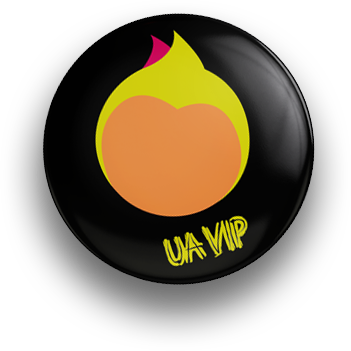
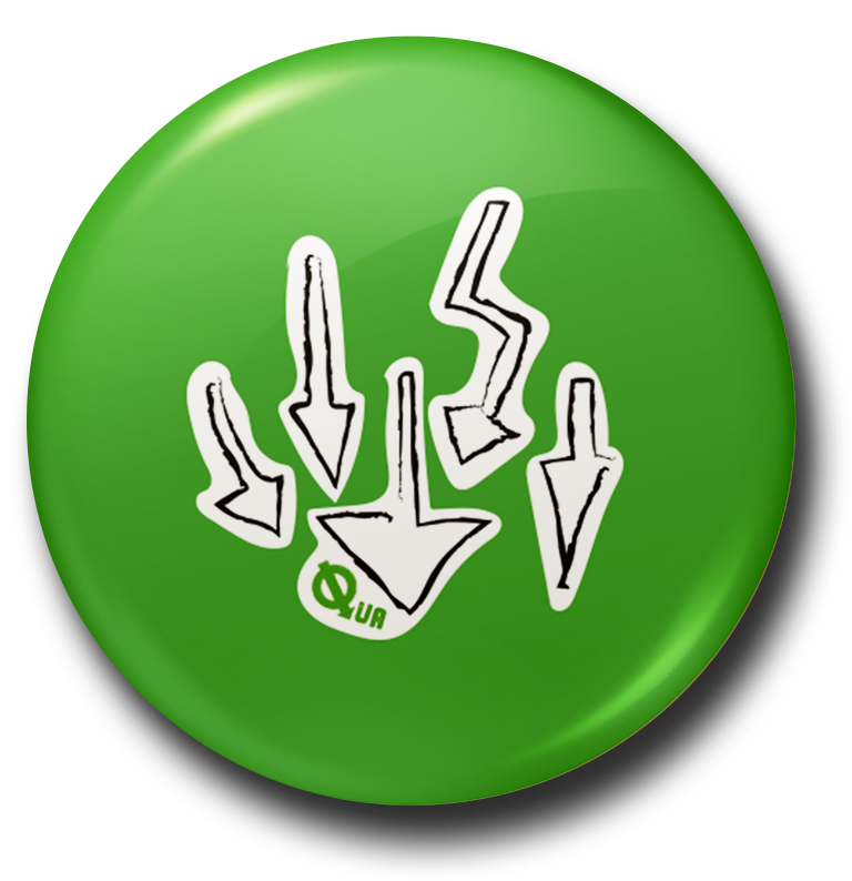
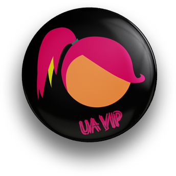
Logo + Wordmark: Rough and raw but still polished enough to print.
Color palette: 5 bright, bold colors to contrast the overall low loght moody feel to give it edge without feeling too dark.
Typography: A mix of cut-and-paste style headlines and clean, editorial body fonts to balance zine roots with professional polish.
Imagery: Candid photography, band portraits, and show shots—some taken by yours truly.
Layout: Designed the entire magazine cover to cover, including ad spots, featured spreads, and recurring sections.
Every page had a purpose. Every design choice was backed by insight from the people it was made for.
The Final Look
Underground Anthems looked and read like something you’d find on the shelf at your favorite indie record store—next to a bin of band tees and enamel pins.
The magazine featured exclusive interviews, band spotlights, contributor quotes, and custom ad placements. It was built for people who live and breathe the music scene, but want more than surface-level hype.
The Glow-Up
This project solidified everything I now build into Riot Girl:
Strategy. Personality. Vibes that hit. It proved to me (and others) that I could take a vision, ground it in real data, and turn it into something so much bigger than a school assignment.
UA was more than a final project—it was my first real riot.
Backstage Pass
🔮 Vibe Tags
DIY Spirit, Pop Punk, Cut & Paste Realness
🎧 Designed With
Late nights + early 2000s alt playlists
📸 Extras
Live band photography, real band interviews, lots of cute merch
🧃 Fuel
Starbucks Doubleshot Energy Drinks + spite
💭 Hidden Detail
One of the “ads” is a collage I made in High School and it’s low key hilarious
💌 Dream Outcome
Printed + stocked in every indie record store in America